Primer #9: Drilldown: A Finer Look Into Option Surfaces
Implementation Unit #3
As promised, moontower.ai includes a primer which is being dripped 1 post a week right here on substack.
Sign up to get early access here.
The moontower.ai Primer is divided into 2 units: Conceptual and Implementation.
To review, the Conceptual Unit which includes:
The Implementation Unit thus far:
Drilldown: A Finer Look Into Option Surfaces
The top-of-funnel tools will narrow your prospects to a short list of names where you have a strong inclination of:
which assets to target
whether to be a net buyer or seller of options in the name
roughly where on the term structure you want to trade
roughly where on the skew you want to trade
Now it’s time to refine the exact maturity and delta range you want to target. For that, we turn to the suite of tools known as Tickers.
If the shopping list of assets you are targeting is related you may want to diversify and do the same trades across all of them OR you may want to trade them against each other. Either way, the Pairs tool allows you to make direct comparisons.
You are now drilling down into the suite of mid-funnel tools!
Let’s take a tour.
Tickers tools
Visit Tickers to zoom in on a single name
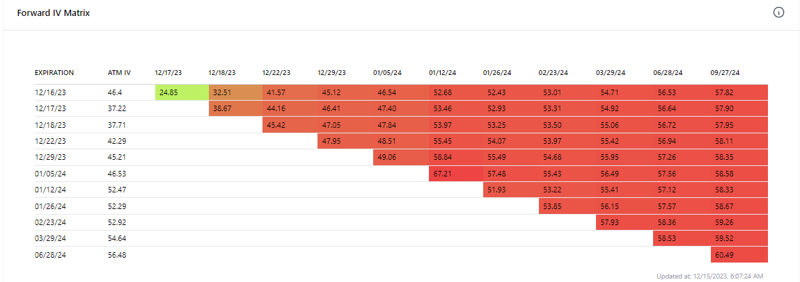
Term Structure & Forward IV Matrix
While the Dashboard tool provides a low-resolution sense of whether the short or longer-dated tenors are relatively cheap/expensive, the term structure tool plots constant maturity IV (y-axis) against the time to expiry (x-axis).
The forward IV matrix uses specific maturities to display every pair-wise forward IV.
Volatility Cone
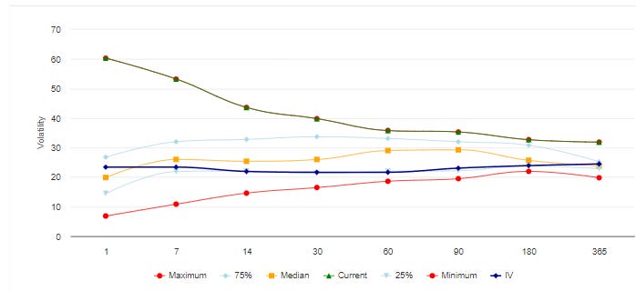
A volatility cone is a graphical tool to analyze the historical volatility of an underlying asset over different time frames. The cone plots volatility on the y-axis and the time to expiry on the x-axis.
The cone is widest for shorter realized volatility windows reflecting the extreme impacts of large moves or a few unusually quiet days on short term realized volatility.
The narrower section of the cone reflects the tendency of realized volatility to revert to a narrower range of possibilities when volatility is sampled over long periods.
By overlaying the term structure of implied volatility on the cone we can get a quick sense of whether the IV is statistically high or low compared to how the asset has moved over a similar time period.
The blue line is the IV term structure. The other lines report realized volatility statistics for various time windows.
Skew
The top-of-funnel Skew tool displays the current level of normalized skew and percentile for the 10 delta and 25d calls and puts respectively.
The Ticker skew view offers a time series view. The user can select:
Constant maturity chooses the closest maturity to the desired term
Lookback period for the time series
Volatility scanner
This tool mimics the Top-of Funnel Volatility Scanner but for a single name only. This allows the user to get a more granular look at fixed strike implied volatility changes per:
Specific maturity
Delta bucket: the tool finds the option closest to the 90 delta, 80d, 70d, etc to montor the vol change
The user can still select whether they prefer to see the changes:
normalized by root(time) to a specific maturity
in click or ratio terms
RV percentile vs VRP scatter
This chart is the same as the REAL chart but for a single name’s history. It allows the user to see where the VRP has been for various percentiles of realized vol historically.
In the chart below we can see that that the SPY VRP is elevated when realized vol is in a low percentile. This is typical. This type of “cloud” chart makes it easy to see when pricing is unusual.
For example, on the right side of the chart we can see that the VRP was elevated even at high levels of VRP which we don’t expect. If you hover over those dots you can see they are the dates that lined up to the Silicon Valley Bank crisis dates in March 2023. High realized vol AND even higher implied volatility? That’s what systemic risk looks like in the options market!
Pairs tools
Visit Pairs to directly compare to names.
Term Structure
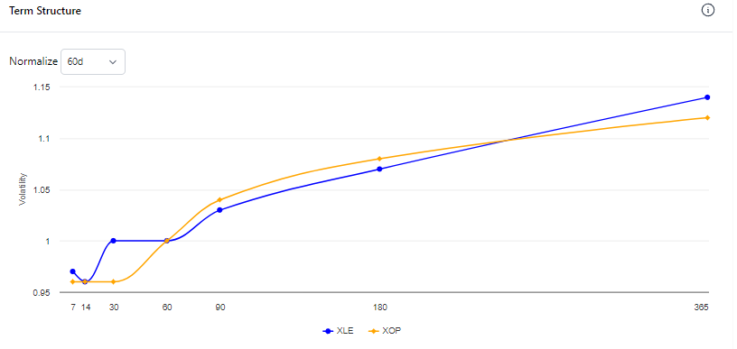
This tool displays 2 term structures on the same chart.
The user selects a normalize term (ie 60 days). Every point on the term structure is then divided by the 60 day IV allowing the user to see the term structures on the same Y-axis to compare relative steepness.
Pair IV Scatter
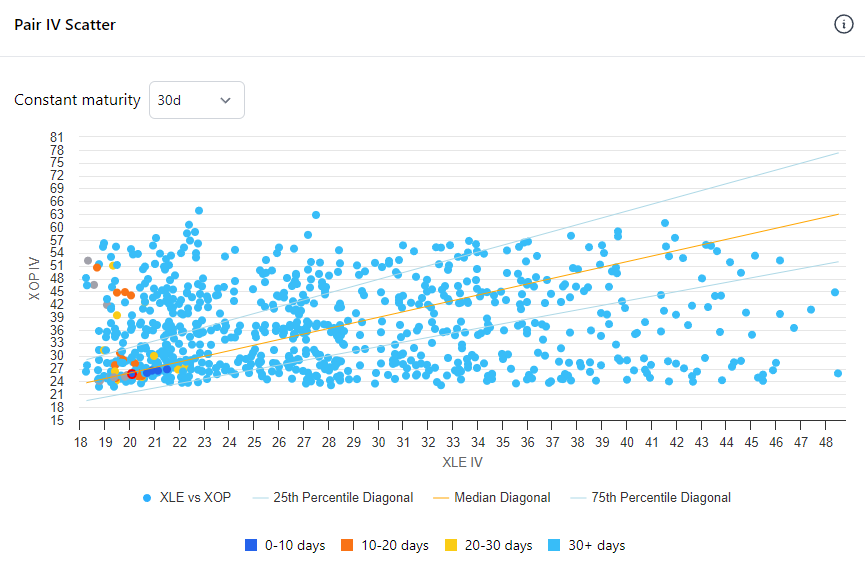
This tool allows the user to compare the IV of 2 names for a given constant maturity tenors.
The user is able to select a constant maturity to compare.
The scatterplot is color-coded by days to bring attention to various regimes.
The lines represent the median as well as 25th and 75th percentiles of the IV ratios.


